CMS 3.0 Goes Responsive
Newly Released | Jan 15, 2015

You asked for it, we delivered. In the latest update to our website framework we wanted to address one of the most requested features, responsiveness. In the context of the web, responsiveness can mean a myriad of things. What we're talking about today is the ability for your website to "scale" to different screen sizes. That means no matter if your website is accessed on a desktop, on a tablet, or on a phone it will still look pretty and function appropriately for that device.
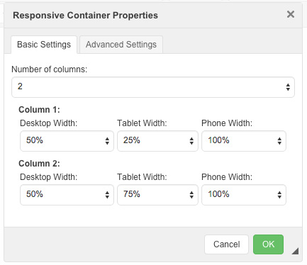
With these additions come some changes to the Content Management System that make it easier to manage a site that can target multiple screen sizes. As a user, you need to have the ability to create responsive columns! That means you need to be able to specify how your content looks on those different screen sizes. There's now a Responsive Layout module in the page editor that lets you do just that.
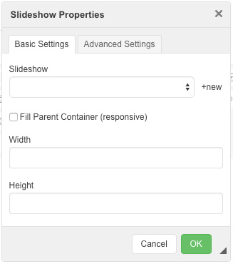
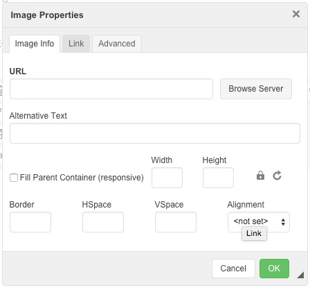
Once you have your columns setup and you're adding content you're going to want to make specific content pieces responsive too, for instance, images, video, and slideshows. Well, you're in luck because we've made those responsive too with a single click of the mouse.
Clicking the checkbox labeled "Fill Parent Container" will set that item to be responsive. The width and height fields will gray out because the item will scale to fill the column it lives in. The item will never scale larger than the native dimensions to avoid pixelation, and in those cases the item will center itself in the container as it grows. In the case of video, the framework will base the full native resolution on the poster image that's selected. As always, it's recommended that the poster image be sized to the same dimensions of the video. Below is an example of the video and image page editor modules.

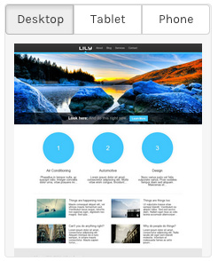
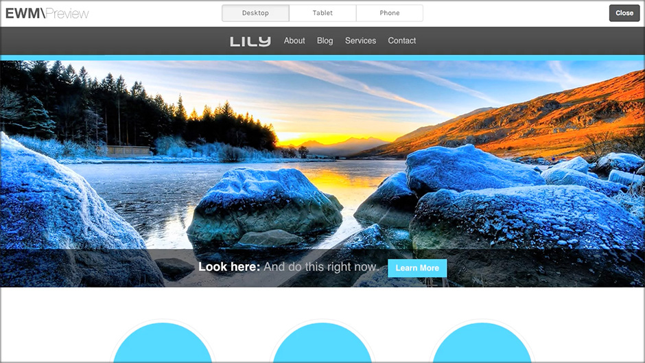
The new previewer not only allows you to switch between the different device categories, but also allows you to switch between orientations. That means you can preview the site as a phone in landscape and in portrait modes, as well as a tablet in landscape and in portrait modes. This flexibility once again gives you more control over your content than ever before. Nobody wants to guess how their business is going to be presented online, and now you don't have to. We're keen on speed and performance and as always these updates keep in line with that, routinely scoring 95+/100 on Google's PageSpeed Insights. We strive to provide the best web experience possible for our clients and their businesses, and we will continue to deliver on that. We'll leave you today with a short video of the new page preview functionality, and a helpful link to our contact info because we know you'll want to jump on the phone and get this update right now.